Mimicking the startup of Bing apps
February 5, 2014Today I want to show how to get the same feel for your Windows Phone apps on start up that the newly released Bing apps (Finance, Maps, Food & Drink, Sports and News).
Since Microsoft started releasing Windows Phone versions of their Windows 8 Bing apps, I have been a big fan of how they look. Mainly the fact that the app name is placed in the System Tray as opposed to within the main app area freeing up precious screen real estate. A great example of how this is the Bing Food & Drink Settings Page shown below. With the app name in the System Tray, its clear that this is the Settings page while still being visually aware of what app you are in.
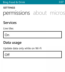
Bing Food & Drink Settings Page
The key elements that provides the clean feel are a single colored splash screen, a white background and a System Tray configured to match. Typically, it is not a good idea to change the colors of the system tray to avoid breaking the feel of the modern UI but in this case, since the entire app carries the same theme through the app, it works well.
Let’s take a quick look at the Bing Food & drink app.
 Bing Food & Drink App Splash Screen |
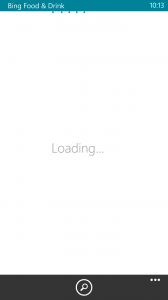 Bing Food & Drink App Loading Screen |
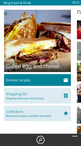 Bing Food & Drink App Fully Loaded |
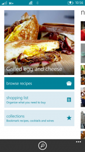 Bing Food & Drink App System Tray Tapped |
As you can see, the color theme carries through the app with the splash screen, system tray and other elements utilizing the same color. This is what I mean when I say the theme carries through the whole app. This is important as it creates (or maintains) the branding color scheme.
Creating a splash screen in the desired color should not pose any sort of issue with the exception of maybe knowing the ARGB values of named .NET colors (if using named colors), but luckily you can hover over the named color in Visual Studio and it will show you the values.
Updating the colors of the System Tray can be accomplished in both XAML and in C# in the code-behind file. Let’s start by looking at how this is done in XAML.
<phone:PhoneApplicationPage
...
    shell:SystemTray.IsVisible="true"
    shell:SystemTray.BackgroundColor="DarkRed"
    shell:SystemTray.ForegroundColor="GhostWhite">
    <shell:SystemTray.ProgressIndicator>
        <shell:ProgressIndicator IsIndeterminate="False" IsVisible="True" Text="Walk Tracker By AtomSocial"
                             x:Name="ProgressIndicator"  />
    </shell:SystemTray.ProgressIndicator>
...
In the above XAML code, we have added SystemTray.BackgroundColor and SystemTray.ForegroundColor to the pages phone:PhoneApplicationPage tag right after SystemTray.IsVisible which was already there. Note how I used GhostWhite instead of White. This is because for some reason, using White doesn’t work. The color ends up being the Phone Accent Color instead.
Once the System Tray has been Styled, the real magic is contained in the ProgressIndicator. By adding a Progress indicator to the System Tray, you gain the ability to set some text. As long as IsVisible is true, this text will display in the System Tray. Tapping on it will slide the text up as the standard System Tray icons slide down. After a timeout period, the icons will slides up as your text slides down. This looks pretty slick and is the exact same behavior of the Bing apps.
As mentioned above, the ProgressIndicator can also be set in the pages code-behind file as well using C#. The SystemTray.BackgroundColor and SystemTray.ForegroundColor parameters must still be set in XAML, but the ProgressIndicator itself is created as seen below.
public MainPage()
{
        InitializeComponent();
        ProgressIndicator = new ProgressIndicator {Text = "Walk Tracker By AtomSocial", IsVisible = true};
        SystemTray.SetProgressIndicator(this, ProgressIndicator);
}

public ProgressIndicator ProgressIndicator { get; set; }
In the above code, I have used created a new ProgressIndicator instance and assigned it to a ProgressIndicator property. Then used the SystemTray.SetProgressIndicator method to make the final connection to the System Tray. I could have skipped this property and created a local variable within the constructor, but did it this way in case I wanted to change the text on the fly for some reason.
The final piece to this is the ProgressBar found below the System Tray. When we created the ProgressIndicator, it would make sense to simply use this to indicate something is happening. Unfortunately, is it located at the very top of the System Tray and is not as visible when the tray is colored. Moving it down would seem to be the solution but I was unable to find a way to do so.
Apparently, the developers of the Bing apps found the same issue and appear to have used a ProgressBar below the system tray to accomplish this. It uses the same color and has a 1px margin above it to create a very small separation of the System Tray and the ProgressBar. The following XAML shows a ProgressBar placed inside a Grid on a Pivot page.
<Grid x:Name="LayoutRoot" Background="White">
   <ProgressBar Name="ProgressBar"
                IsIndeterminate="False"
                IsEnabled="False"
                Foreground="DarkRed"
                VerticalAlignment="Top"
                Margin="0,1"/>
<!--Pivot Control-->
<phone:Pivot >
...
The Grid has a white background since that mimics the Bing apps and helps the chosen app color pop on screen. It is given a name so it can be enabled and disabled as needed although in an MVVM app you would be binding this to a property in your viewmodel. The margin is set and foreground color is set to the chosen color.
The following screenshots are from an app I am currently working on. All the pieces described in this article are implemented in it.
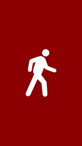 My Walk Tracker App Splash Screen |
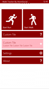 My Walk Tracker App Loading Screen |
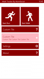 My Walk Tracker App Fully Loaded |
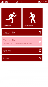 My Walk Tracker App System Tray Tapped |
I have also tried to mimic the menu items as well using the Telerik RadHubTile control. Although not covered by this article, it shouldn’t be too difficult to mimic the rest of the feel of the Bing apps, although I don’t recommend it. You really should do your own thing. What i have described is all built in and simply needs to be configured. The application layout should be uniquely yours.



Comments are closed.